So I’ve been using Gmail Meter on my work account for a couple of months now because I’ve always been interested to know how and whether email at work is used efficiently.
I don’t have any conclusive data (because I’ve not been actively tracking things!), but I thought I’d share some interesting statistics which recur every month, without fail (the graphs and pie chart I’m using are from July 2012, BTW):

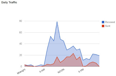
- From the visual above, most email is sent in the morning and just before lunch.
- People enter the office after lunch and try to send a bit of email but they’ve more or less cleared their quota for the day.
- Work is still done in the evening, after dinner. Work-life balance, anyone?

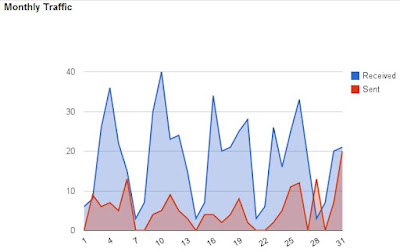
- LOOK AT THOSE PEAKS! The most emails are sent at the start of the week, on Mondays.
- Thankfully not a lot of traffic on weekends, though you can see some traffic from me last weekend – I was clearing stuff in preparation for the surgery I underwent on Monday.

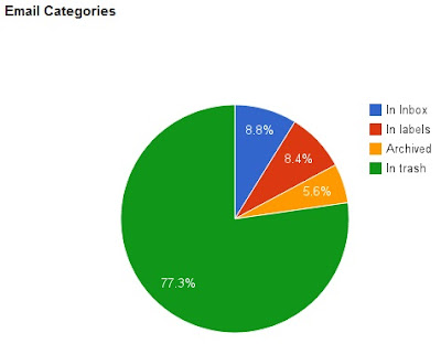
Last but not least, most email messages I get are not exactly… relevant to me. Either that or I don’t like storing a lot of mail in my inbox.